After months of wondering whether or not Corona-Warn actually worked, I finally received proof positive confirmation that it does. The moment the strange new notification squeezed its way into the queue of never-to-be-opened Reddit suggested posts was a moment of strange emotions. First came the novelty—wow, this actually does something! And then came the concern. Of course, I would’ve rather went through this whole pandemic wondering whether or not Corona-Warn did something than ever have exposure to COVID.
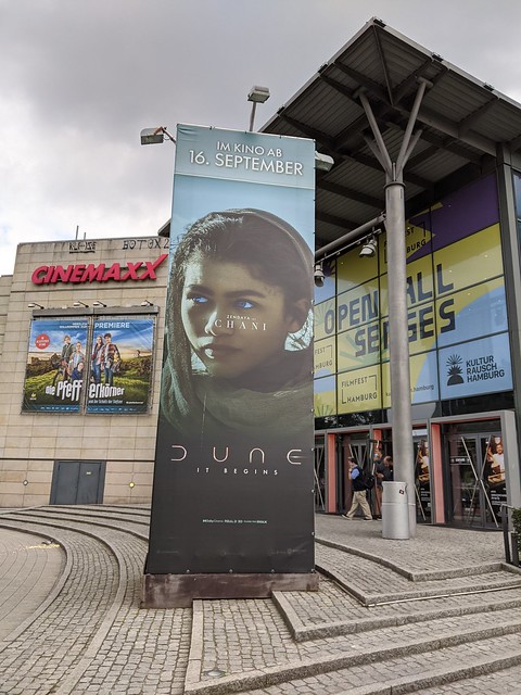
Since I got my full vaccination, I’ve decided to start trying to carve normality back into my daily routine. I am still taking advantage of the work-from-home offer in our office but I started daring to do small things that were previously out of the question. That meant getting on a train to have coffee in Berlin. And popping up in various restaurants even without a reservation just so I can move them off my Trello list. And stepping inside a movie theater finally so that The Rise of Skywalker is not the last film I have ever watched inside a proper theater; and oh boy is Dune a big gun to break this duck.

(Note: While I still think one of my gods, Christopher Nolan, is rather snobbish, if not outright mistaken, for insisting that his latest film Tenet is an experience that can only be realized inside a proper movie theater, I gotta give it to Denis Villeneuve. Dune is an experience for the big screen. Or, actually, it’s not so much the screen but the expensive acoustics of a movie theater. That film engulfs the audience and the sound—shout out to Hans Zimmer’s ever-impeccable work—is a huge part of its magic. In my pantheon of contemporary film makers, Christopher Nolan just had a companion.
But still, great films should have enough to stand on even if the sound is streamed through a ~30EUR Bluetooth speaker.)
I also decided to see buy tickets to Alanis Morissette’s concert in Hamburg. I’m not exactly a huge fan and I even came late to the party. I discovered her music just a few years ago alongside entrenching my fascination for dark and clear skies. My Spotify streamed Jagged Little Pill as I wrote TypeScript for Kalibrr. Nonetheless, I thought it would be such a strong “pandemic over” statement, being able to join a crowd in a live performance. Heck it was even booked in a football stadium not five minutes away from my apartment by bike. What’s not to like?
Unfortunately, for the time being, I would have to keep striking out my usage of the verb see when talking about this concert. It was canceled, due to the very thing I thought it made a statement against. Apparently, it’s still too cumbersome to bring a whole production on the road given the situation. Score one for the pandemic there.

Another thing I have taken to is that, finally, I’ve set foot inside Zanshin Dojo’s premises for the first time since March 2020. In between the first and the second waves, Zanshin Dojo started to offer outdoor classes. Attending these sessions was actually the primary reason I bought my bike. Of course, as soon as they could, indoor classes were also offered at a limited capacity. But despite the withdrawal of outdoor offerings due to the unsuitable conditions of autumn, I opted not to take any indoor classes; I thought the risk was just not worth it. This decision will be vindicated as Germany went into a second lockdown just a few weeks after the outdoor sessions stopped.
And then, it happened.
Coming to my senses after an initial dismissiveness—I received the notification almost a week from the purported exposure date; never mind that the long incubation period is among what made this pandemic a smashing global phenomenon—I noticed that the exposure date fell on a Thursday. I could’ve only contracted it in my first ever indoor class since the pandemic began, not in the restaurant I visited that week, as I initially thought.
This suspicion would later be confirmed as I received a call from Zanshin Dojo itself, informing me that someone among the participants of the class I took on 14 Oct tested positive for COVID. The Global Pandemic 2, Chad 0.
(By the way, no worries at all. My quick test after the fact returned negative results. Unsurprising as I am fully vaccinated anyway. I even went in for my second indoor session that week.)
But still, I am rather put down by how the activities I am taking up precisely in a personal attempt to declare the pandemic over do nothing but keep reminding me that it is in fact not yet over. I don’t remember asking for a Damocles’ sword ever hanging above my plans.
I even thought my next blog post would be the first in a while to not bear the tag “coronatimes” and yet, here we are. Frustratingly, the pandemic finish seems forestalled until further notice.
I have already talked about the things I’ve been doing to keep myself occupied outside of work in this pandemic. A curious observation for me is how my focus shifted towards active pursuits, rather than passive. Creative rather than merely consumptive. I’ve planned to spend my days reading books and while I’ve had quite a success on that front during last year’s spring, my free time efforts have shifted drastically after I got my Wacom tablet.
I’ve been teasing a comparison of what a game changer Wacom is for me, as opposed to my previous workflow of drawing on paper and then scanning it (with my phone). After my injury, my spring has been spent recovering while my summer has been busy utilizing my rehabilitated left arm. But today, you are in luck. I have some season-appropriate drawing comparisons to make.
The manual workflow needs a lot of post-processing—time I could just spend making another piece and even then I haven’t really found a reliable post recipe. Not to mention, a very controlled lighting set-up that I simply didn’t have. Take for example, this portrait I drew of Death of The Endless from Neil Gaiman’s Sandman, circa 2018.

I want to say from the get-go that the actual sketch looks better. This is digitized from Google PhotoScan with a Google Pixel phone, the best of several attempts. Of course, I can’t really exhibit how the actual piece comes across to me but what I noticed here is how the colors are far less vibrant and how there’s a lot of detail lost in the shading and the line work.
I am actually really pleased with PhotoScan. It’s not its fault that it isn’t a scanner for artwork. It had to make algorithmic choices with the data presented to it. And this is where the choices lead to.
That said, how about straight from the camera app? Will it do any better?

The midtones and shadows are immediately better at the expense of the highlights (i.e., Death’s pale skin). Better, and yet still leaves much to be desired.
Before we go any further, I think I should explain what I’m going for in this piece. I wanted it to be a rendition of that scene in The Kindly Ones where Morpheus talks to his sister for a final time. I have referred to this scene (and to this piece) as “It Always Rains on the Unloved”. There is also some intentional imagery behind the framing. Do you have any idea what that might be?
Back then, I didn’t really have a visual motif to go for. I just wanted to do a good drawing of Death.
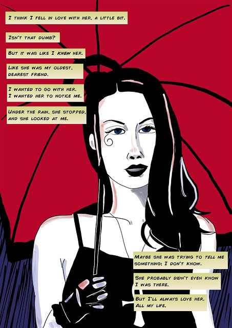
Which leads us to today! I have decided to recreate this drawing using Wacom. The past year I have been really learning a lot about illustration and draftsmanship. You have seen me go for a visual style before, with varying levels of success. This time, let’s see. I wanted to go for a very early 90s comic book look, reminiscent of when Sandman first came out, as well as, to some extent, the jarring flat visual style of The Kindly Ones arc, where this scene heralds from.

I have to say, this went better than I expected. I am actually personally satisfied!
Back when I first mentioned my new digital painting hobby, I mused at the outcome of re-drawing Embrr, The World’s Most Dognified Dog, The Biggest Puppy I Know, etc. I noted how the illustration I made of him back when we still shared residence had a very soft boyish character to it whereas my newer attempt painted his features in a more compact bulk. I see a similar shift in this exercise with Death.
My 2018 attempt at Death had softer features; the digital version, in contrast, has an angular face and an almost diminutive framing, further emphasized by the additional space at the right side of the piece. In fact, the digital version reminds me of someone I have drawn previously though, unfortunately, it’s been a while since I last saw this reference in person.

I really intended this to be a straight-up portrait, but the visual style I achieved just compelled me to make this comic-captioned version, like it’s straight from the stories. Though the portrait’s inspiration came from The Kindly Ones, this text is adapted from the haunting closing pages of the World’s End arc. How postmodern isn’t it?
The digital paintings I have posted in this blog is just the tip of the iceberg that is my oeuvre. What’s more is that, save for the pets, the portraits I’ve posted here have been exercises in implementing a specific visual style; they don’t really reflect the techniques that I’ve come to develop and rely on, in my free time learning digital art. So, I decided to do another piece that is in my own style.

Coming to comic book stores near you!
A few closing notes
- While I am satisfied with my draftsmanship, I gotta admit I wanted this last one to look a bit more like the previous one. I mean, it is still recognizably Death of The Endless and The Endless take on different forms depending on the viewer but it seems the viewer has changed slightly in between portraits. My point is, I’m not yet good enough for consistent character designs.
- In making these pieces, I actually broke a rule I’ve been practicing and that’s to never use the extremes of #FFFFFF (white) and #000000 (black). That is, once you go black
you never go backyou paint yourself into a corner, committing that this will be the darkest shadow (or lightest highlight, in case of white) of your picture. No one is ever ready to make that commitment, unless your are drawing Death of The Endless, I guess. - Maybe using the extremes of black and white is inevitable when you’re going for a 90s comics aesthetic but I couldn’t justify an extreme shadow in my personal style. Hence, I used a brush with opacity features in order to bring some variation and character into the darkest areas of the image, though it was loaded with #000000 black.
- All that said, I am really pleased with how my color choices came together for the last one! It seems it really helps to know a thing or two about color theory.
P.S. This is a Part I. If I ever get around to it, and the subject matter coalesces into something coherent, we will have a Part II. Thank you for subscribing to my RSS feed.


